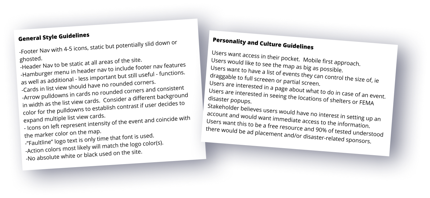
FaultLine is a progressive web app designed as an informative and educational earthquake preparedness tool.
progressive web app = instant access to mobile, tablet, and desktop versions without need for sign-up or install
Project spanned from May - August 2020 averaging 3 hrs a day/4 days a week. Designs were built from the ground up with limited research from a past team of data scientists.
Earthquake applications for users are generally less intuitive and contain unorganized and confusing jargon. They steer users with a feeling of urgency and there is no focus on preparedness. Comparative benchmarking had many different solutions for event notifications, none of which were convenient or editable. Users would have to pay, sign up, or get a premium membership to unlock the feature.
United States Geological Survey (USGS) is the government agency in charge of reporting Richter scale data. They receive Richter data and reports from people and post them for public purview.
They show most recent international events with no easy way to narrow down user-preferred data. Accessibility concerns related to layout, nav placement, and modal placement need addressing as well.
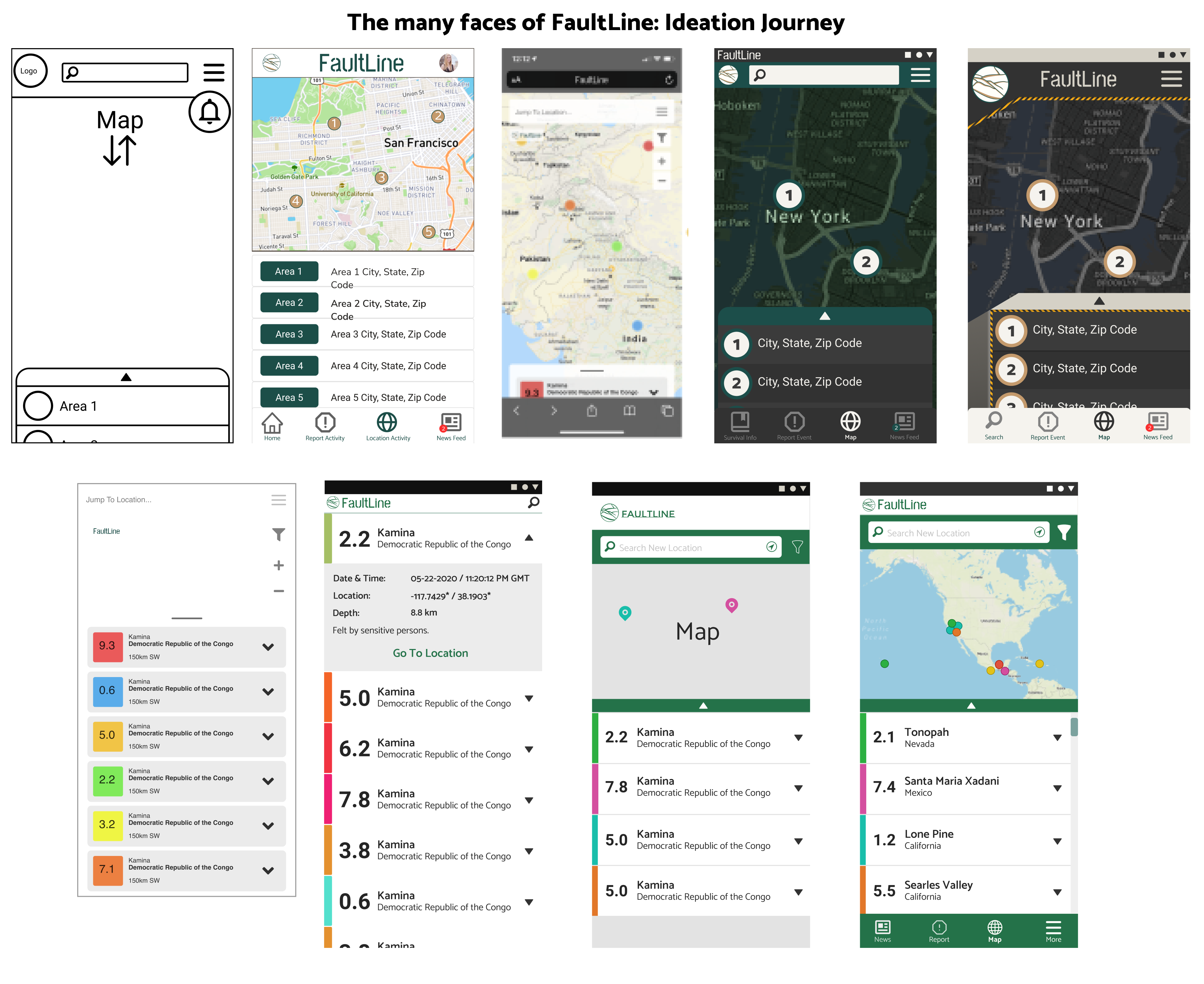
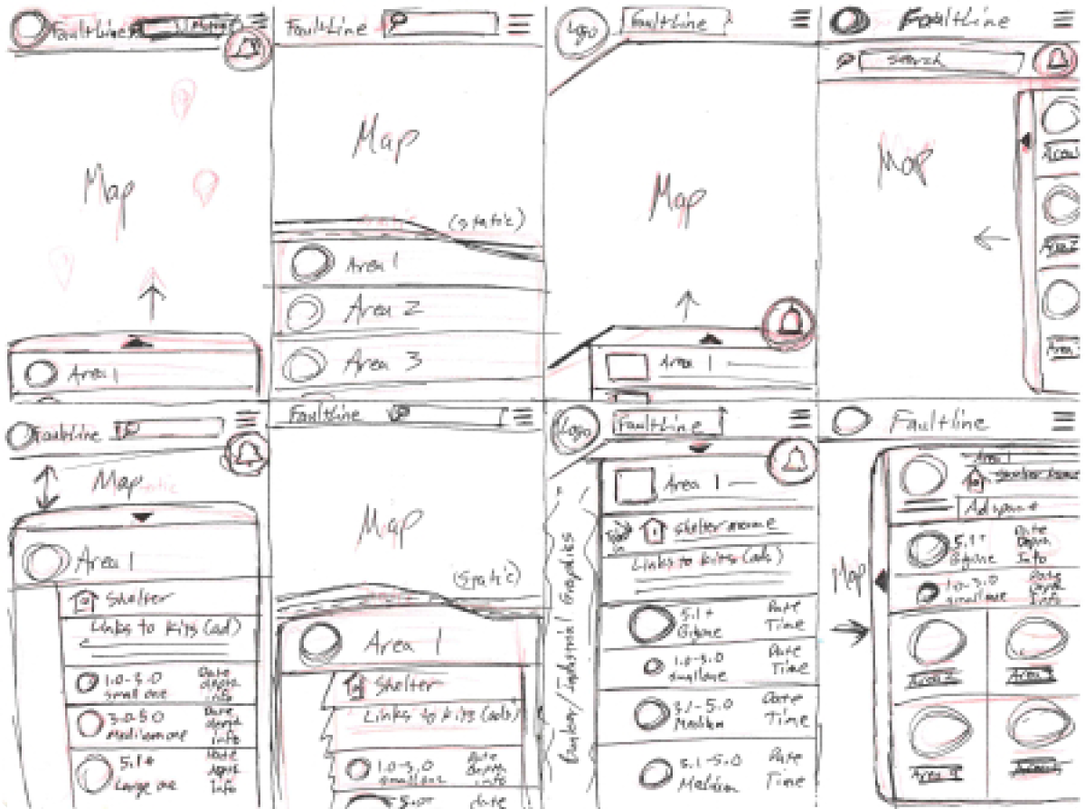
From first wireframes to ideation with feature and nav placements, and ideations per user testing, designer peer review, and surveys.
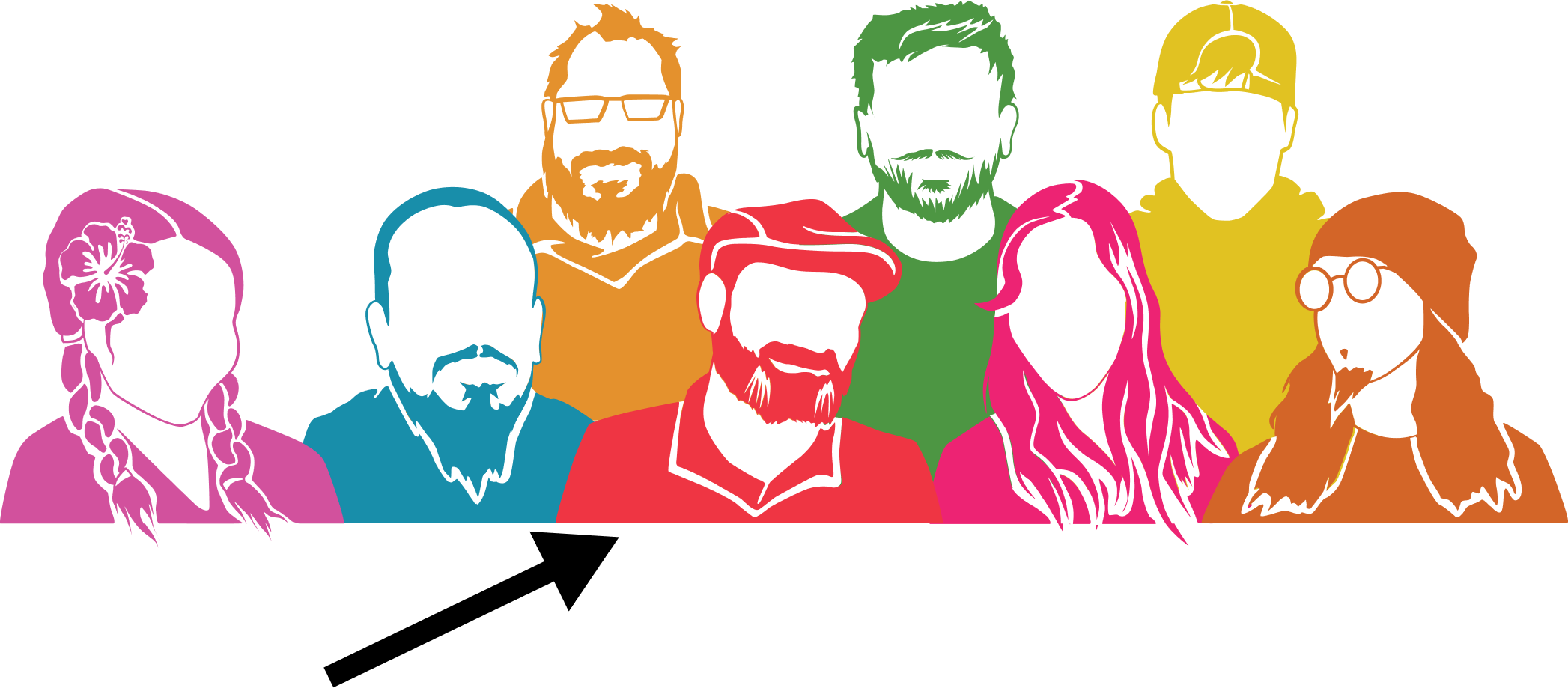
The class project team: 6 full-stack web developers, 2 UX/UI designers
My project role was 80% UI design/graphic illustration and 20% UX research, survey, and testing. A fellow UX designer was able to schedule time during the day for better responses to questions we worked out together.
I collected the data typically and became the primary contact to the development team for UI revisions, components, brainstorming, and discussions.
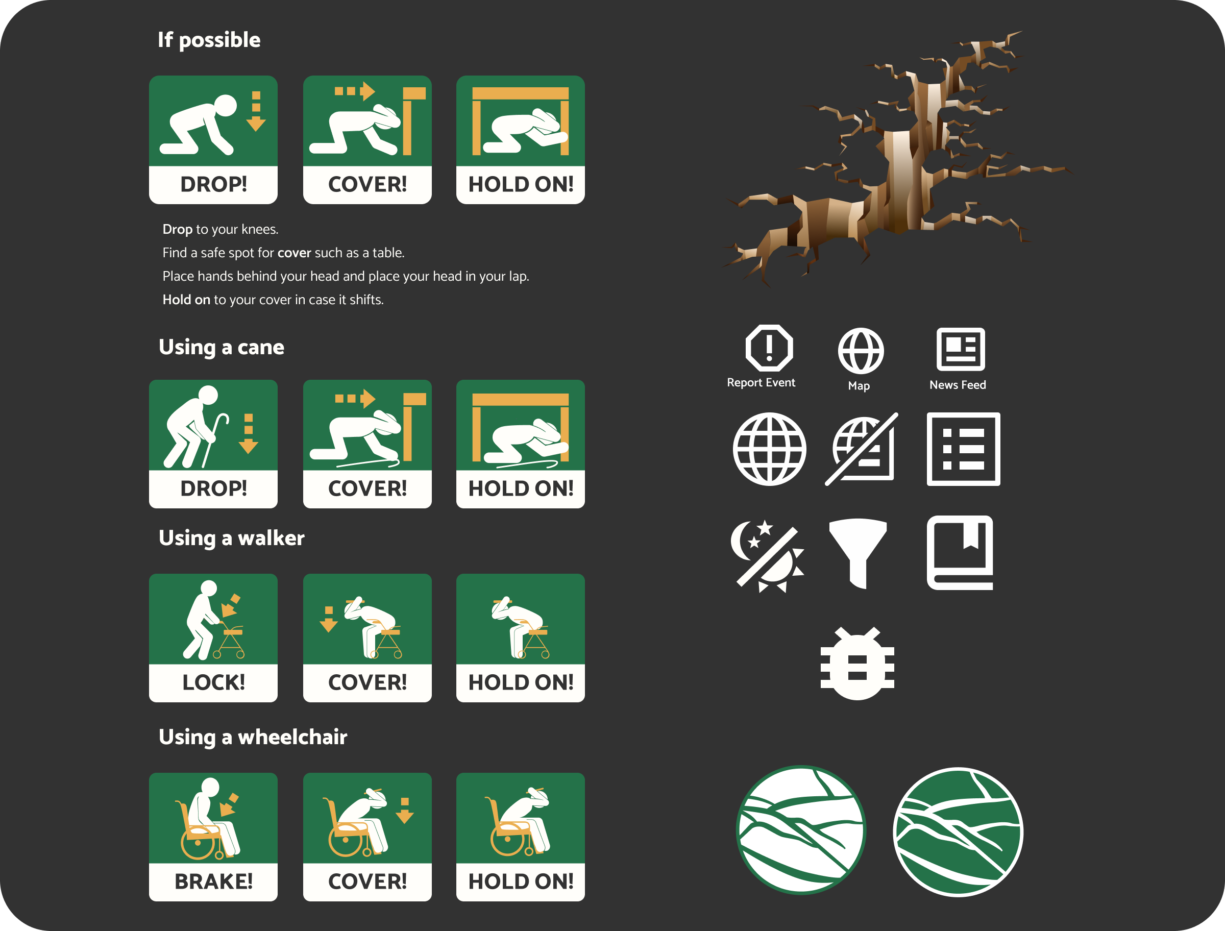
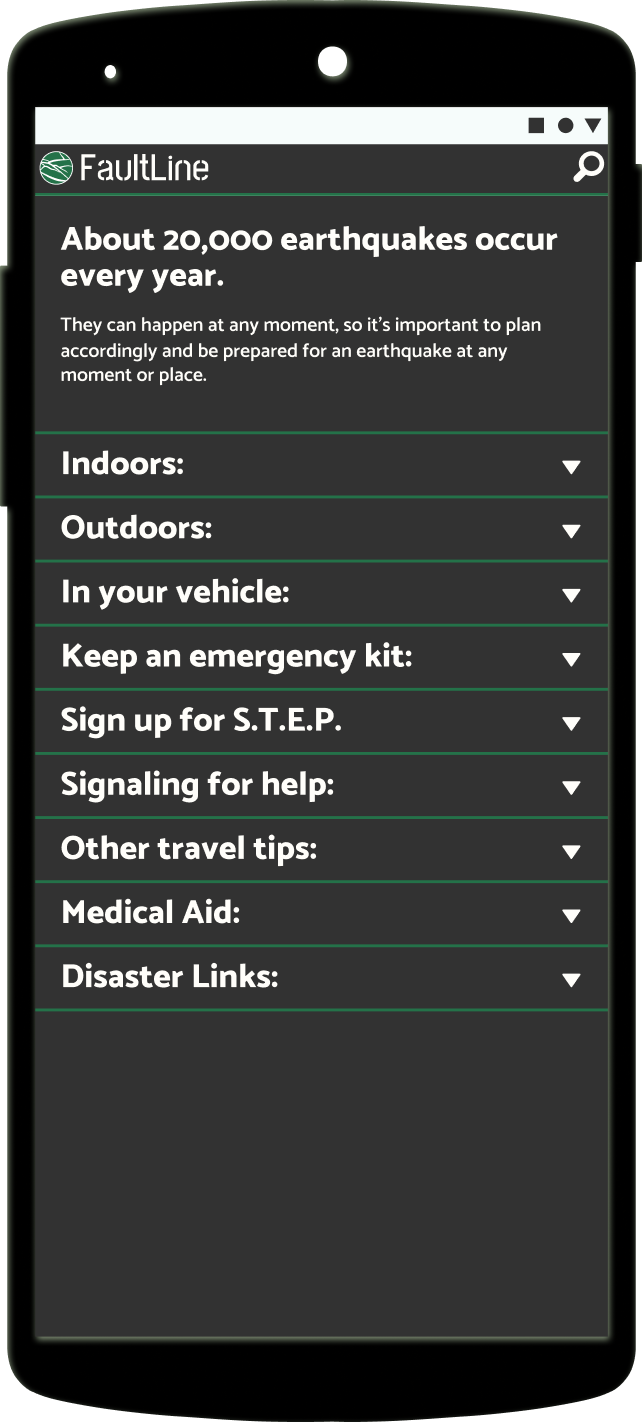
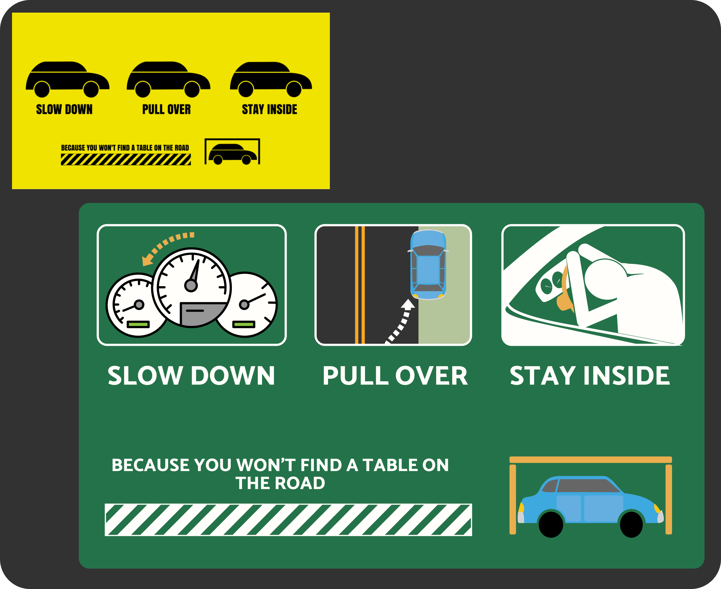
I pulled research from US disaster preparedness guides and adjusted them with project colors and used “penmen” for non-cultural non-gender specific graphics.
My goal was to make graphics that could explain the process without language or cultural barriers.
I modified it to be more user-friendly on the right. I didn’t think the icons described the steps needed to take in case of an emergency.
an easy to use application that
lets them monitor quakes where they choose
report quakes they feel
a news feature with relatable stories
connect past data with present data
filter areas
link sources in one easy location
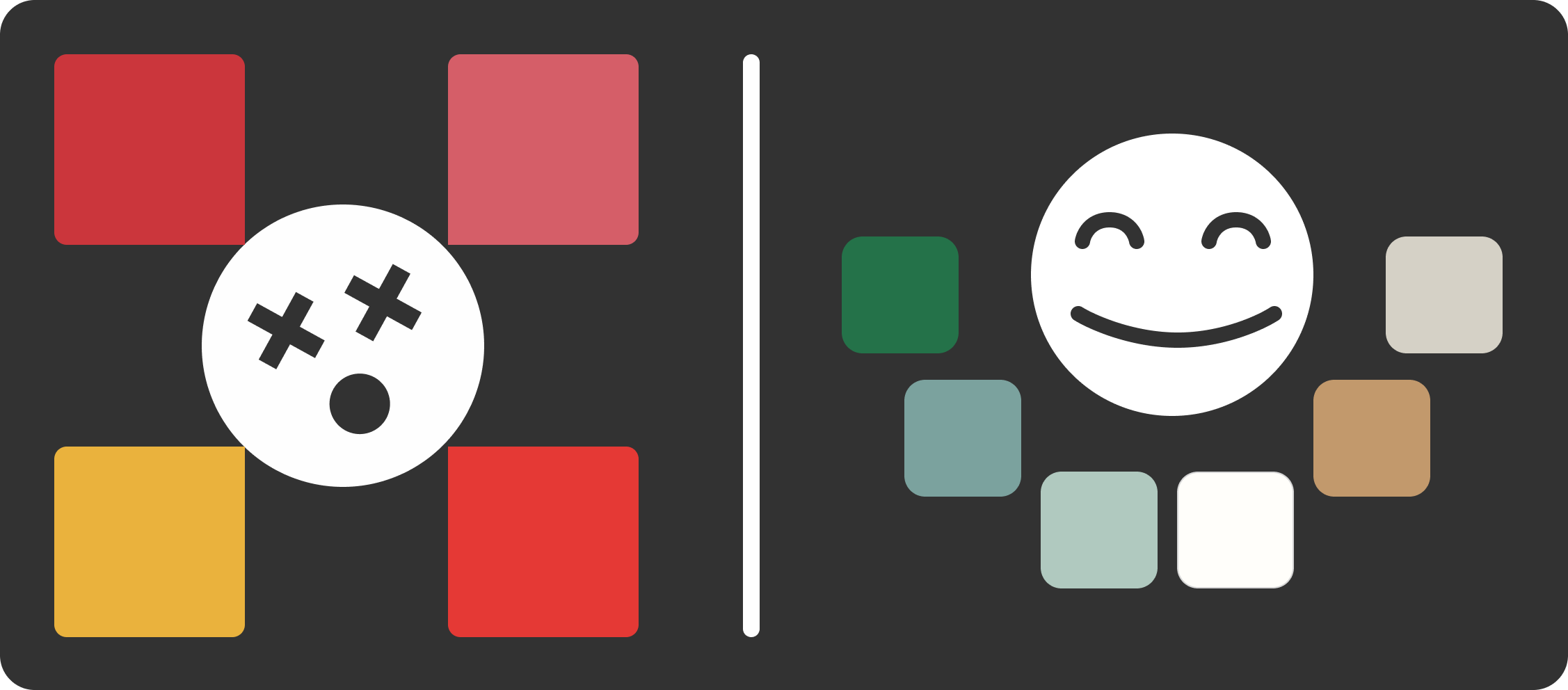
We experimented with cooler earthy colors and neutrals.
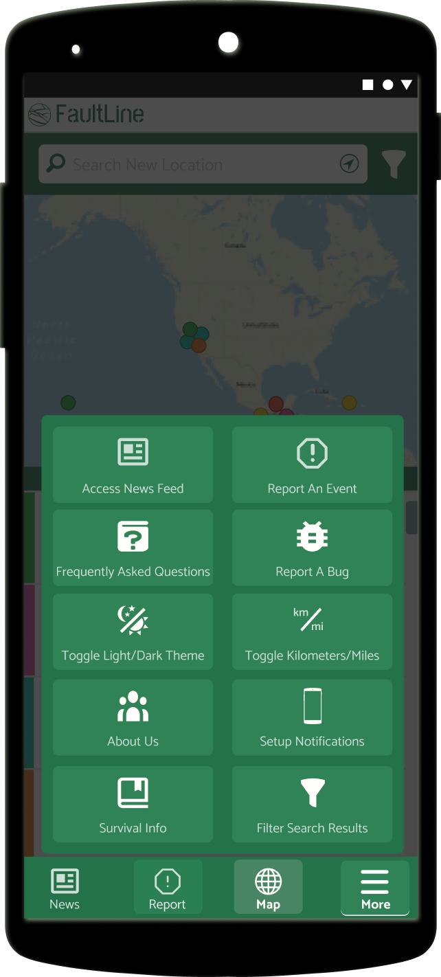
We brainstormed features and decided a survival info page was MVP
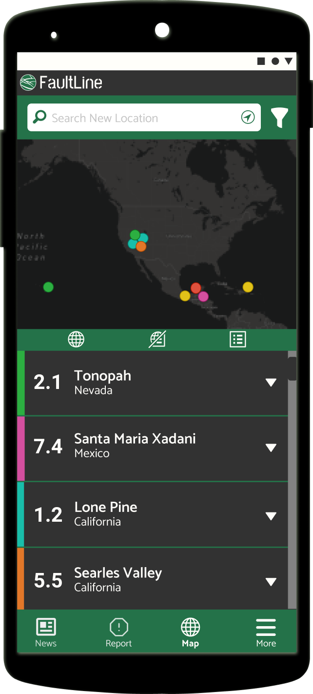
The developers opened up conversation about making a dark scheme option to reduce eye-strain. My design mentors learned in past projects that having a darker background led to less user frustration and calmer micro-emotions.
We decided to rename the site FaultLine. The project began with the name Quake!
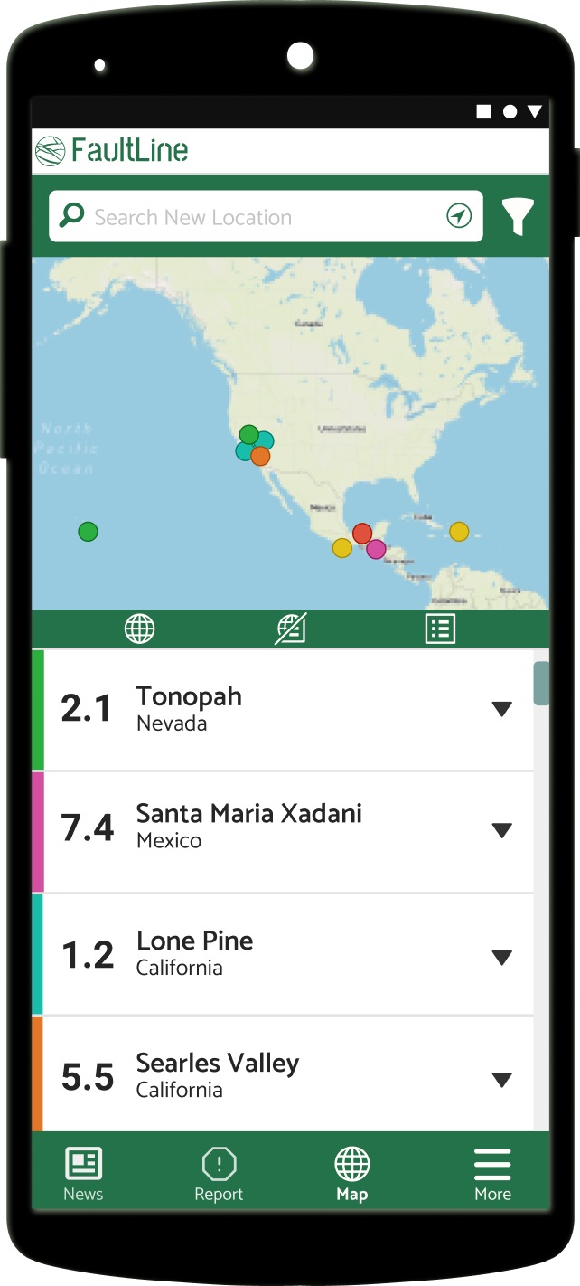
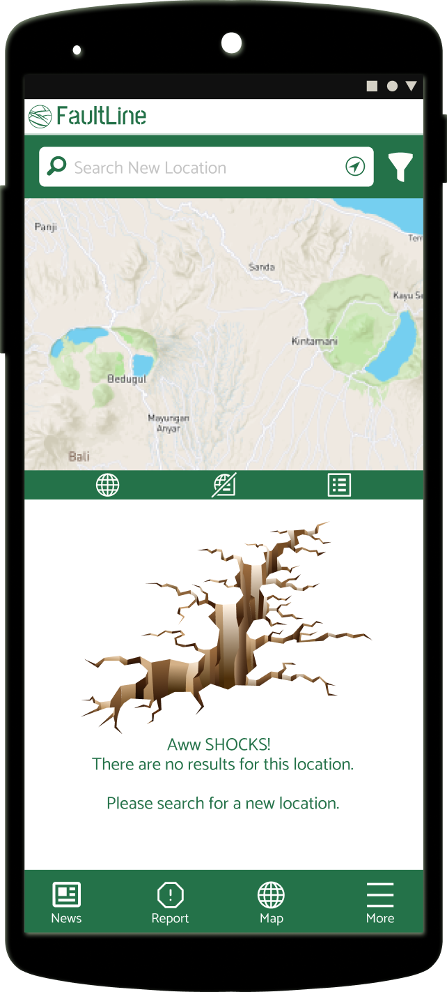
Features have been organized with informative and educational tools as a priority.
I typically do benchmarking before research surveys or team brainstorming.
There might be a lot of hurdles a competitor thought of.
There might be areas I consider doing differently.
It gives fuel to the questions I want to ask users about their experiences.
We did research from 8 other competitors, and learned a great many of them didn't consider accessibility, ease of use, or had what to do in case of an emergency.
We can brainstorm about accessibility, layout, and features without troubleshooting or sifting through old code and design.
There’s a certain freedom to starting a project from scratch.
The stakeholder can be open to ideas about logos, style guides, and color schemes without having to think of cost to rebrand existing products.
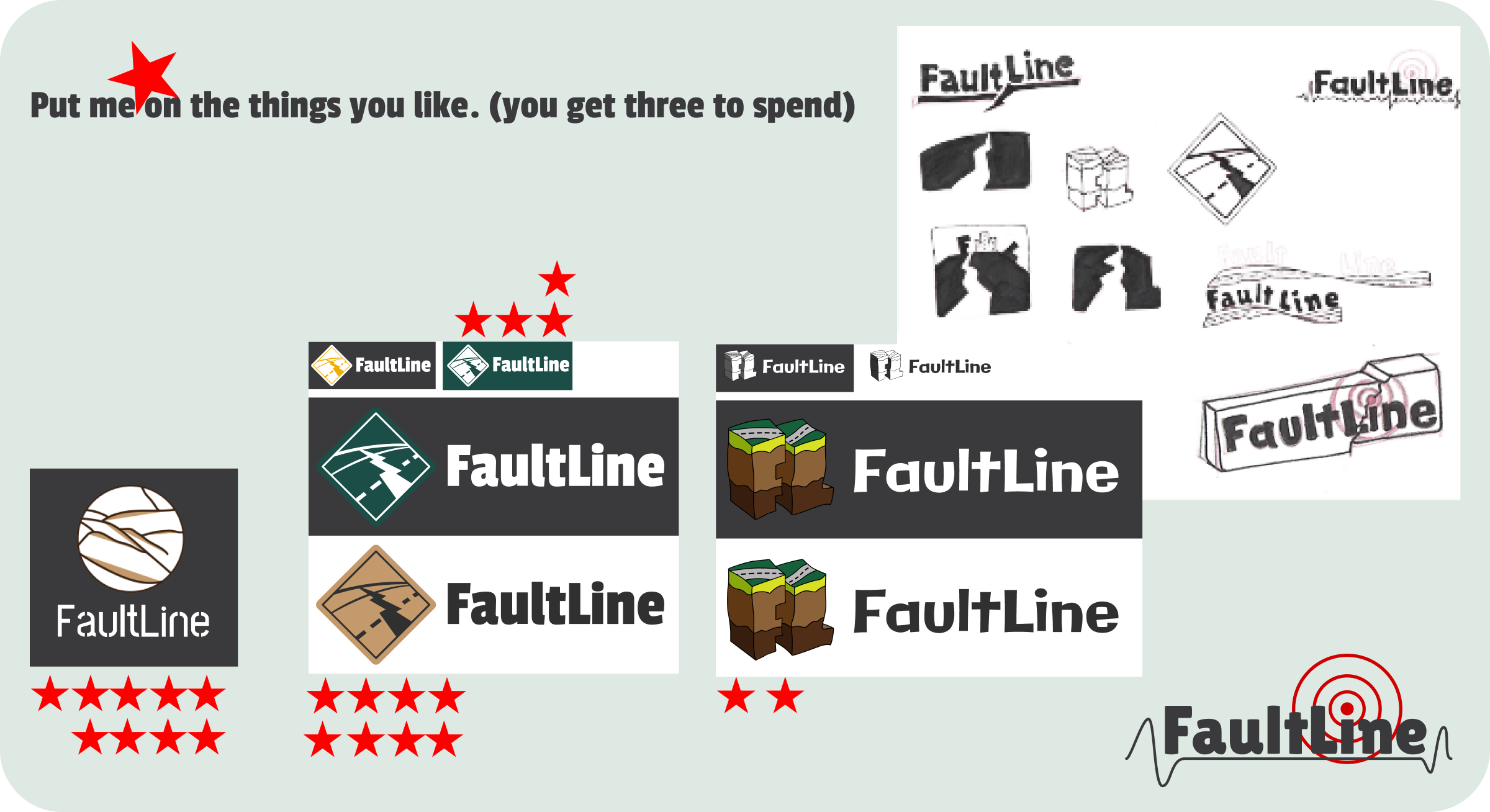
One thing I really enjoy during the research phase is coming up with logo designs, and at least get a two-color logo scheme figured out if there isn’t branding for the company built yet.
I like starting this in the research phase of the project, because I think it gets users more interested and feeling like we’re building toward something more legit, less “what if” or meta.
It can also open up to a more conversational interview and users might drop their guard a little more.
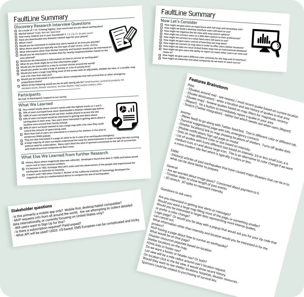
100% of participants preferred a mobile layout.
64% of participants wanted a text message (SMS) feature based on an area they determined instead of defaulting to where they lived because they might be concerned about family members in high-risk areas.
Many of the competitors have accounts the user has to sign-in to, and there is either a lot of complex digging to change the determined area, no control beyond a setting toggle on/off, or an additional cost for a premium version to unlock the feature.
We received mixed results about users concern for themselves with earthquakes.
Where that number changed was if they lived or had family that lived in high-risk areas.
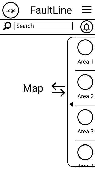
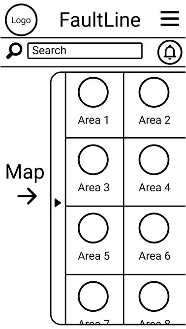
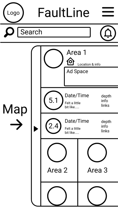
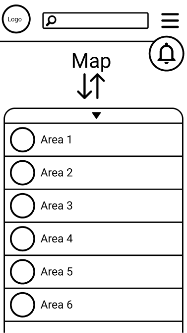
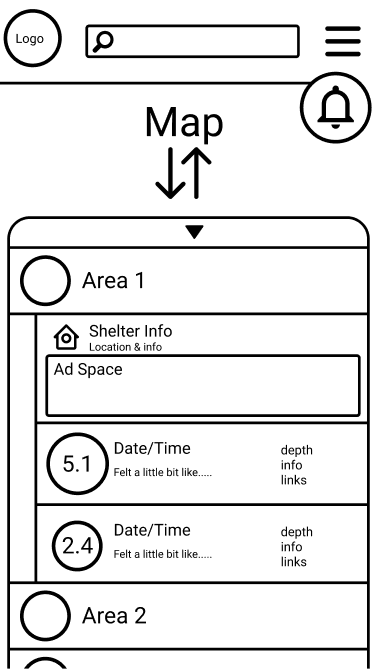
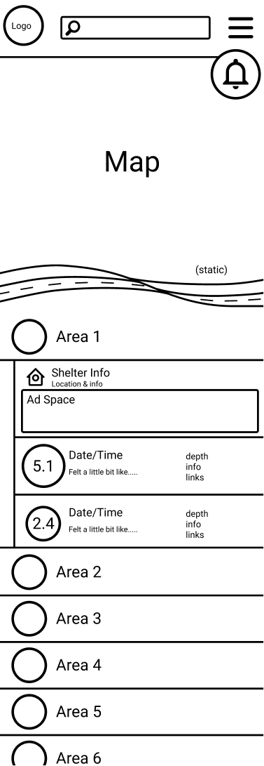
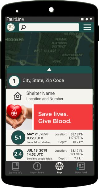
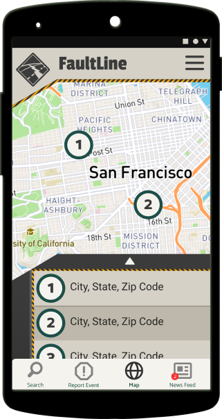
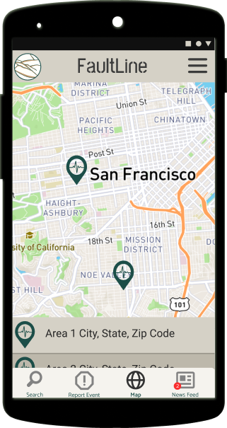
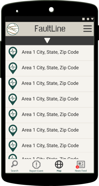
More than half the users wanted a resource for survival awareness, shelter locations or FEMA popups, and a large map with a list view they could control the space used.
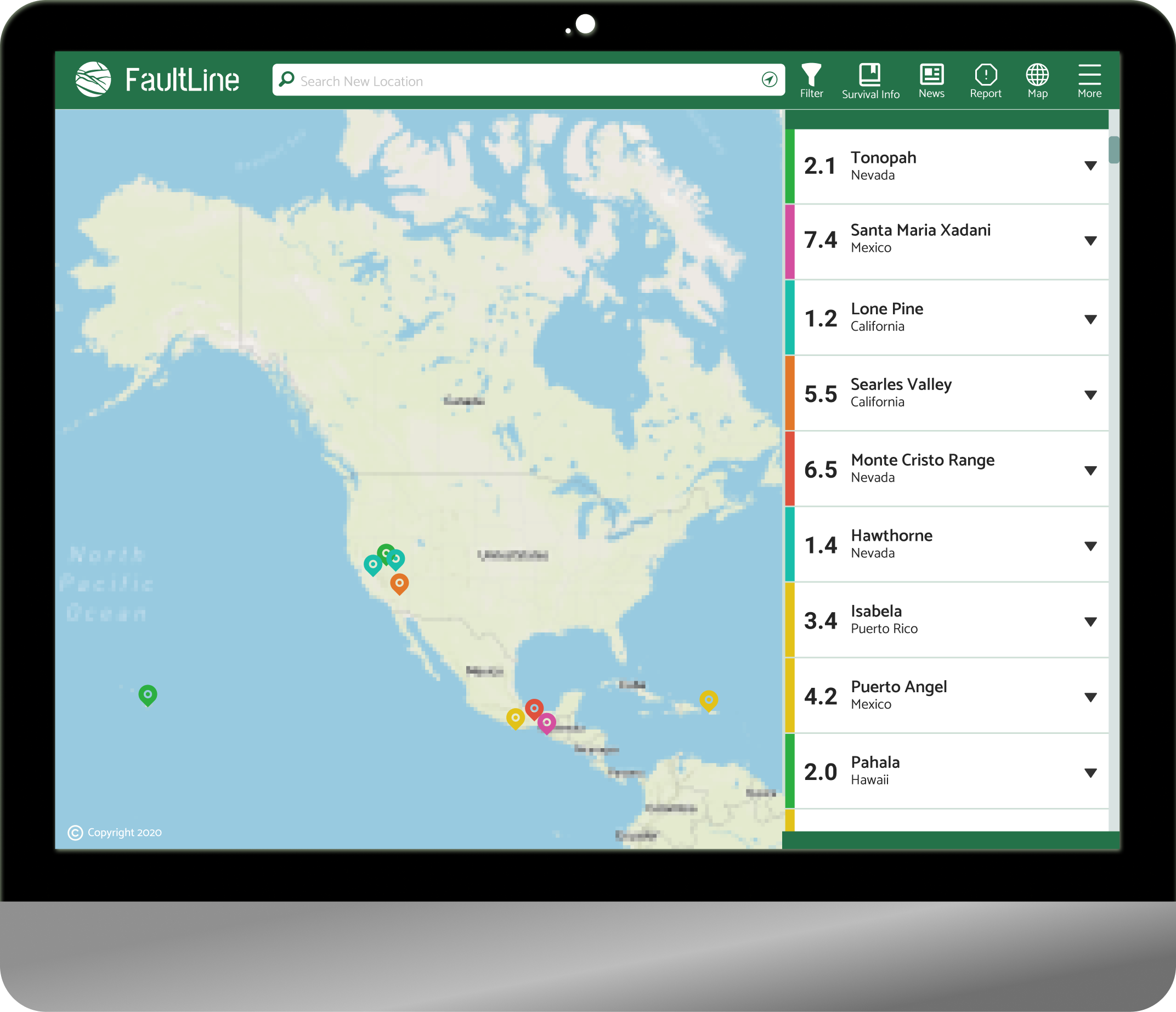
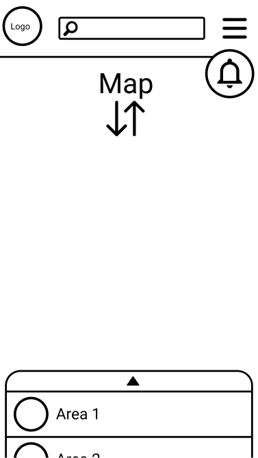
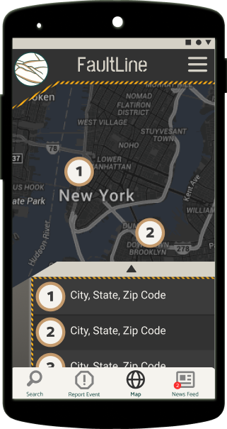
A map that could be moved and scaled smoothly, a list view with search and sort filters, a news feed with disaster-related stories or more info for a selected event, the survival guide with links to disaster resources, a report event feature, and an internal database collecting data if USGS is unavailable and vice-versa.
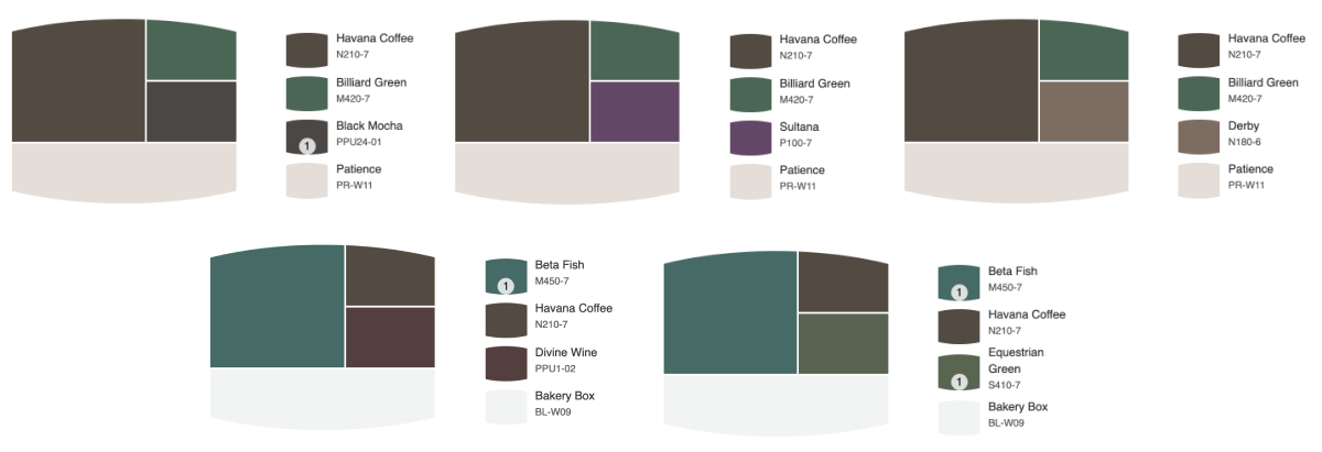
A thing that sets me apart from typical designers is when I start thinking color. I gather inspiration using paint chips.
My experience in media design and signage, I’ve learned the best way to keep continuity is a universal swatch easily achieved by clients and production.
No need for updating Pantone books or having printers try to match.
Very often a product can be painted.
I also enjoy the tools in paint sites that help finding complimentary, accent, and contrast colors.
I derive web color based on these, and test for contrast using the Stark plugin.
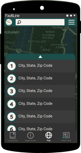
Dark theme with green action with search bar and hamburger menu at top.
Bunker theme dark/light version with most important items as footer buttons.
Lighter neutrals as a high contrast test with most important items as footer buttons.
This section under construction.